
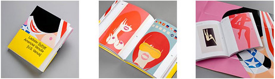
The last few weeks, we’ve been posting the amazing work of Ladislav Sutnar. Ladislav Sutnar (1897-1976) was one of the first designers to actively practice in the field of information design and information architecture. His work was based on rationality and the process of displaying massive amounts of information in a concise and organized way to benefit the general viewer. Typography and a limited color palette were stressed in his work.
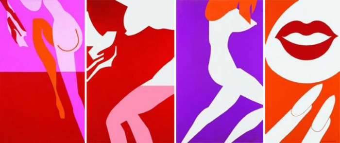
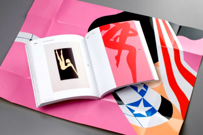
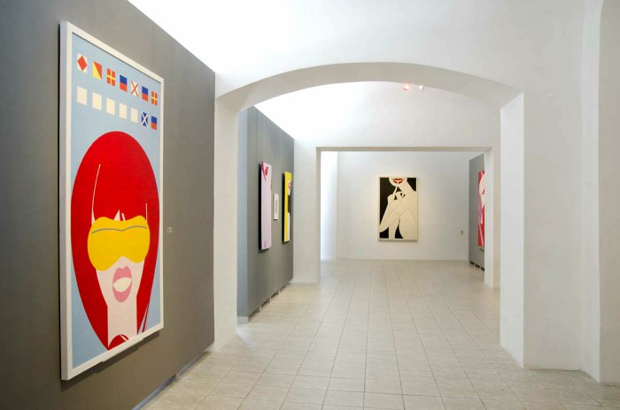
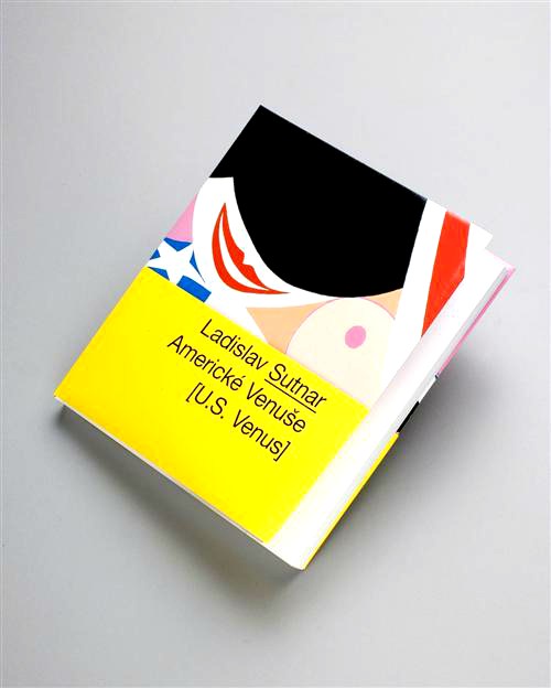
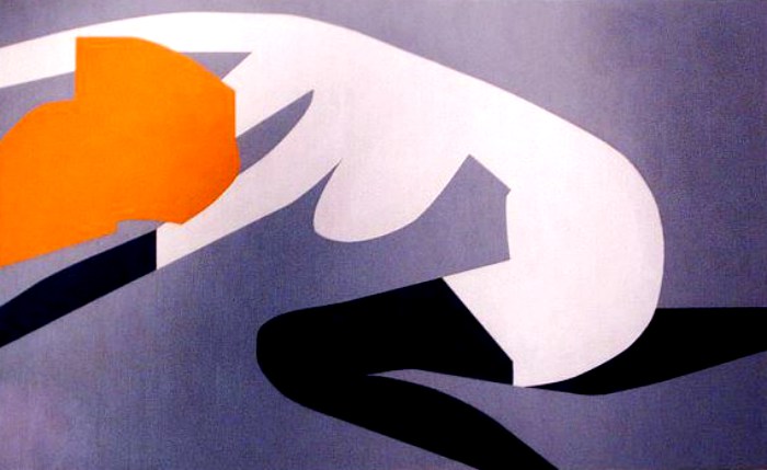
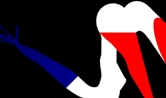
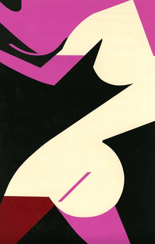
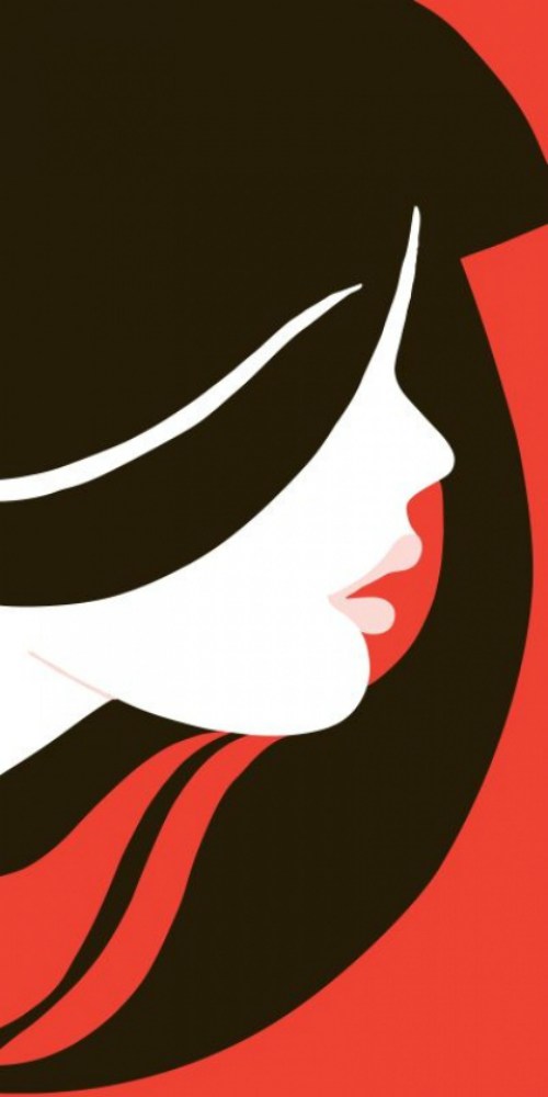
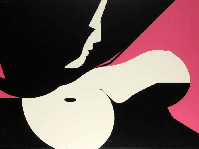
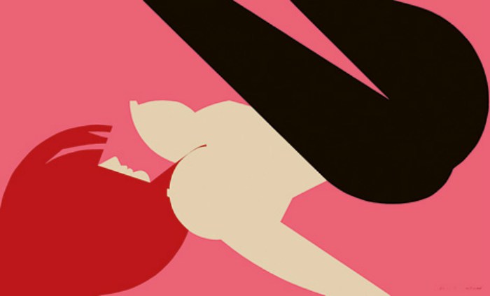
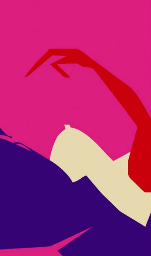
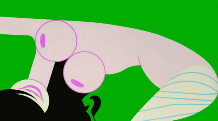
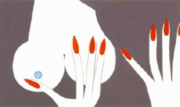
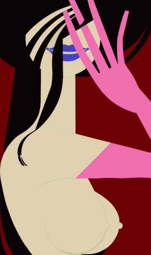
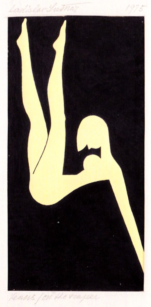
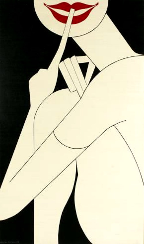
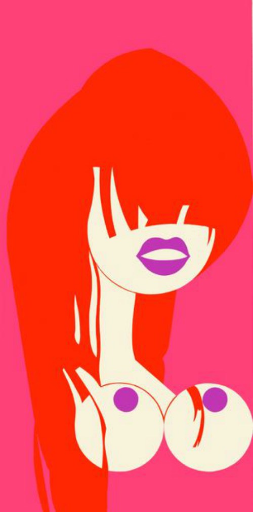
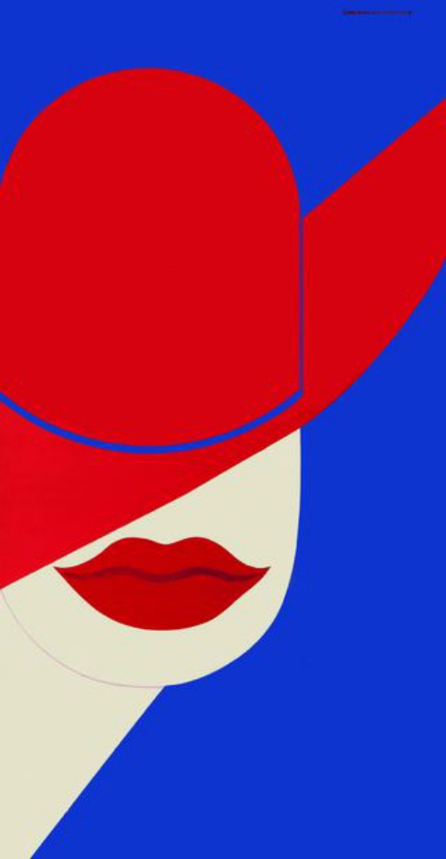
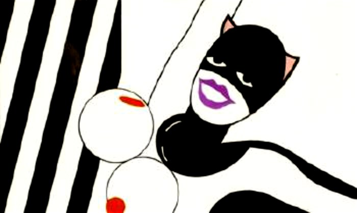
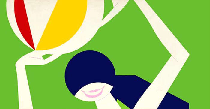
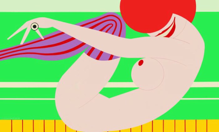
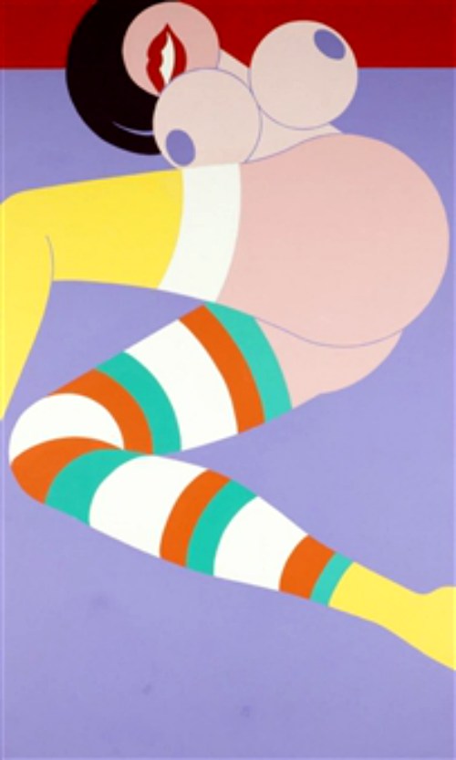
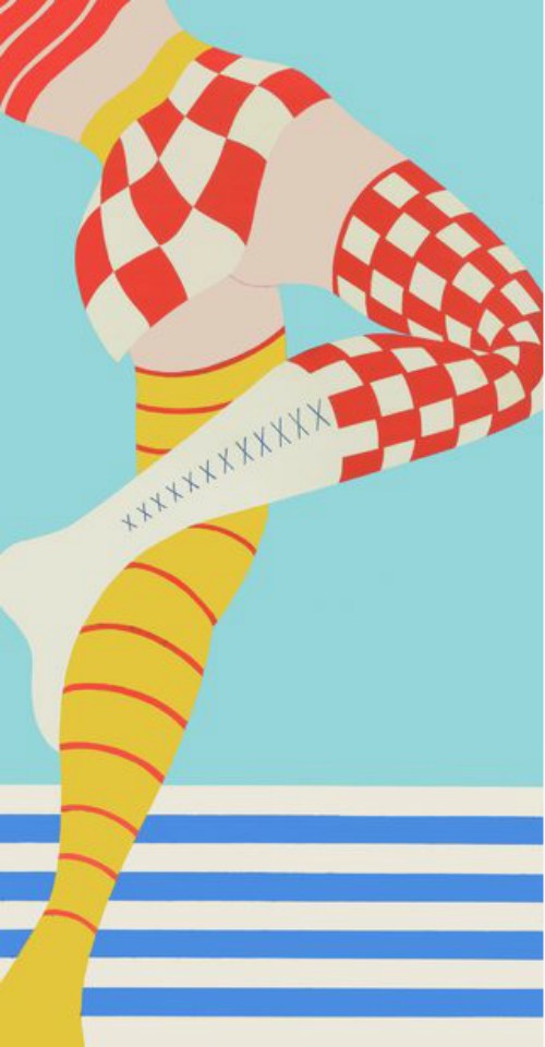
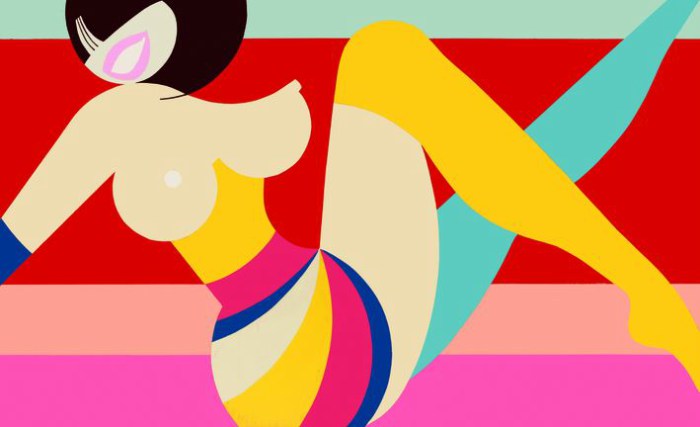
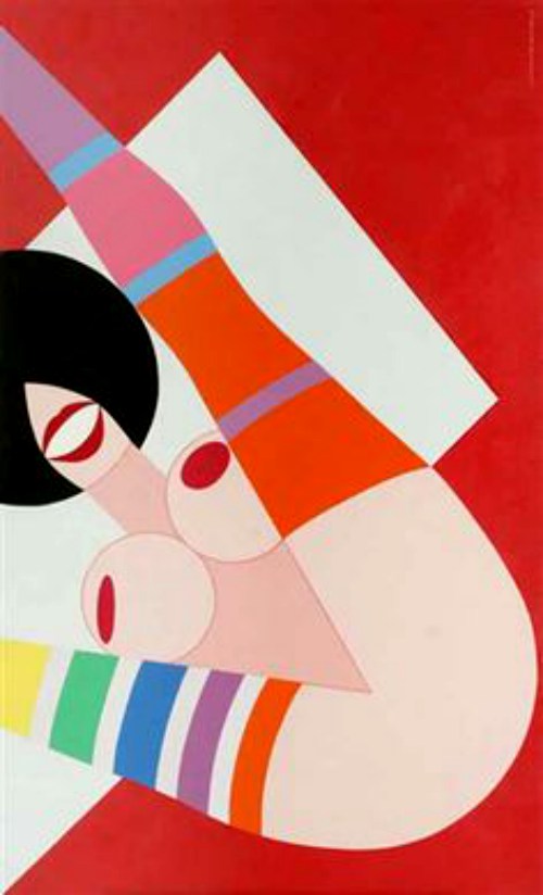
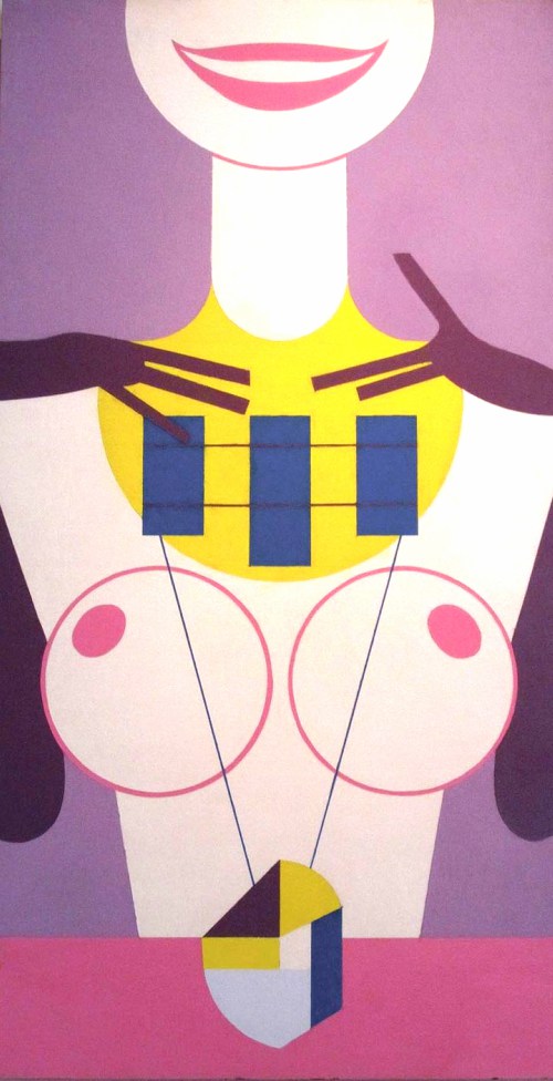
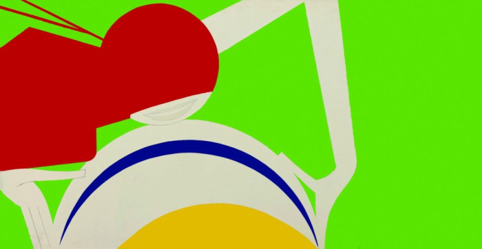
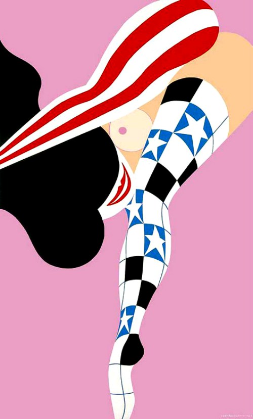
In this final installment of his work, we will look at Strip Street, an album he created in 1963. This was an album of 12 erotic silk-screen prints.
After 1960, Sutnar’s commercial work was fading. These paintings and a series of retrospective design exhibits were an attempt to revivify his business. Not surprisingly, as the graphic design dried up, he devoted himself more prodigiously to these lesser-known paintings and prints.
These works are outside of his design norm, yet they still include Sutnar’s hierarchical design approach as a father of modern information design.
The dangerously racy (for the time) Strip Street compilation has relatively been forgotten until the last couple of years when sites like Pinterest have made sharing images common. It’s awesome that even today, people are instantly stopped by his work and take an interest in it. This makes it obvious that his work has stood the test of time.
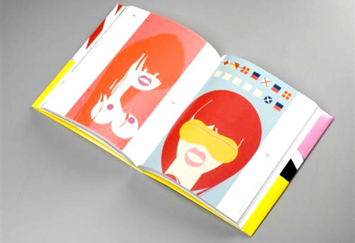
Many people do not know that he also wrote an essay to accompany the Strip Street series.
“What was ordinarily a quiet midtown street during the day would transform every night into the famous strip street known far and wide as the sexiest place in town,” Sutnar wrote. “It was never charming or neat but the embodiment of the shrewd business of pushing the sale of liquor with attractions of the flesh under bright colored lights. In the grab for the fast buck, tawdry physical vulgarity, obscene language, and a close low view of human behavior unmasked in a quest for a variety of temptations were the predominant attributes of the street’s world of dubious entertainment. Intangible, perhaps, yet the phenomena expressed itself distinctly by its own strong and indescribable mood.”
During the hot summer, a shimmering purple-red neon glow projected from the street high into the dark skies, and it was against this view that Sutnar was introduced to what he called an “exotic shadow-play, moving to the swinging beat from the clubs.”
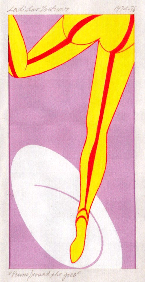
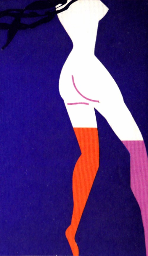
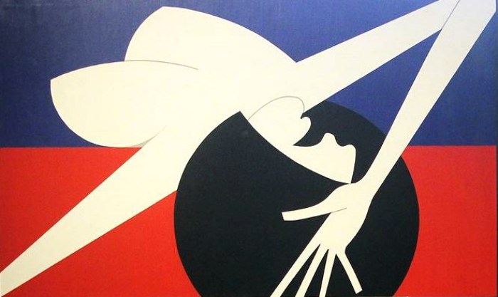
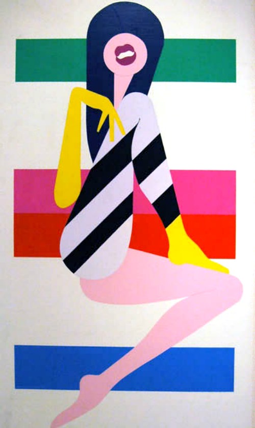
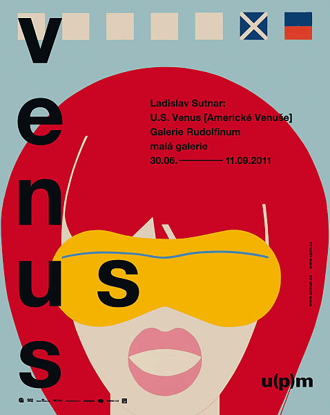
During the 1960s, the street was transformed by the city’s building boom. The steamy and tawdry urban lifestyle was bulldozed under and would have been forgotten had Sutnar not decided to celebrate his early New York experience in paintings and prints that he alternately called “posters without words,” “Venuses,” and “Joy Art.”

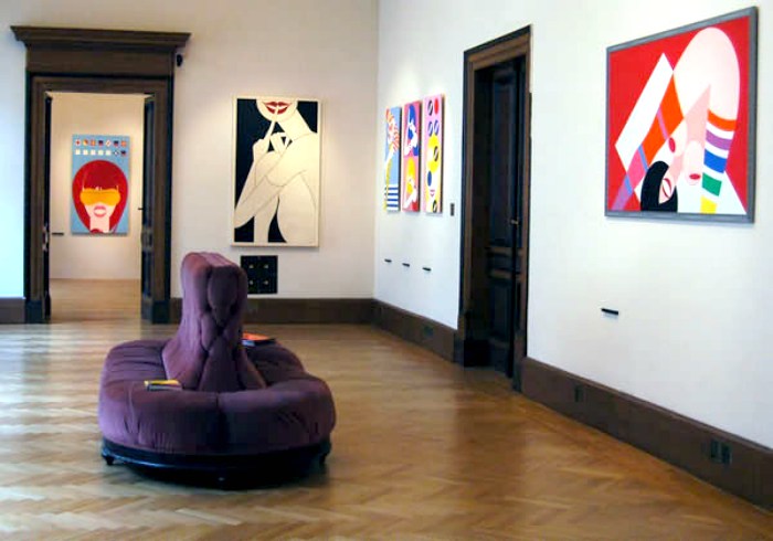
Sutnar later organized two New York gallery exhibitions of his nudes, In Pursuit of Venus (1966) and Venus: Joy-Art (1969).
The Venus series was shown in a few New York galleries between 1966 and ’69 and at the Art Directors Club in 1975.
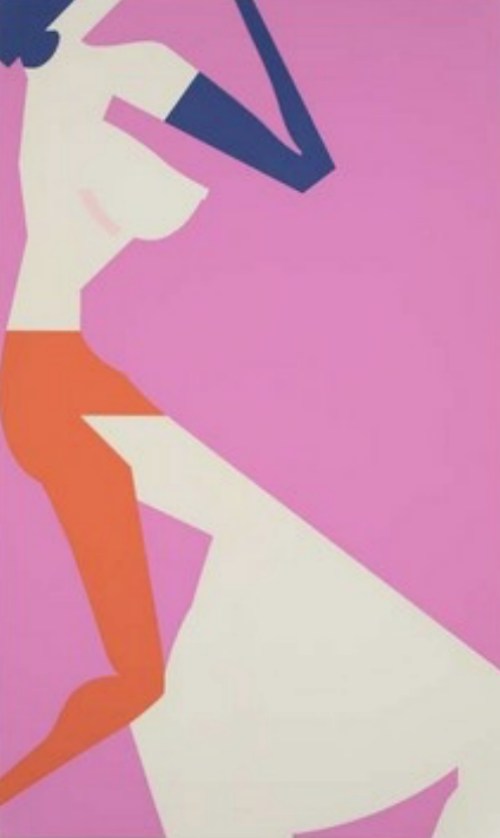
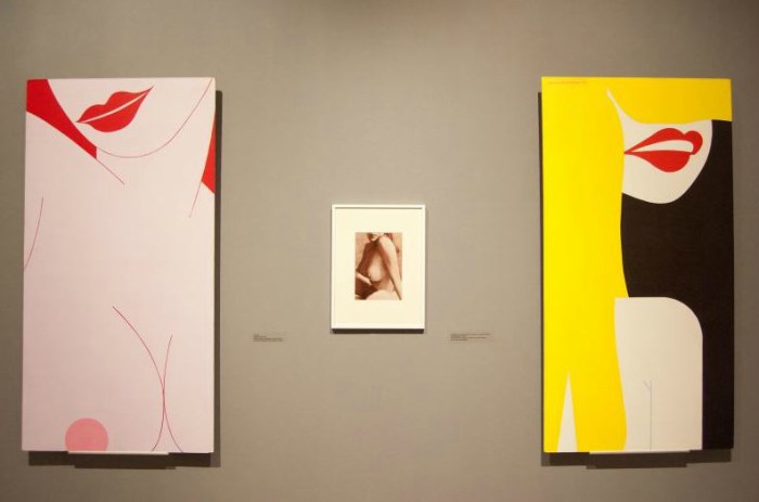
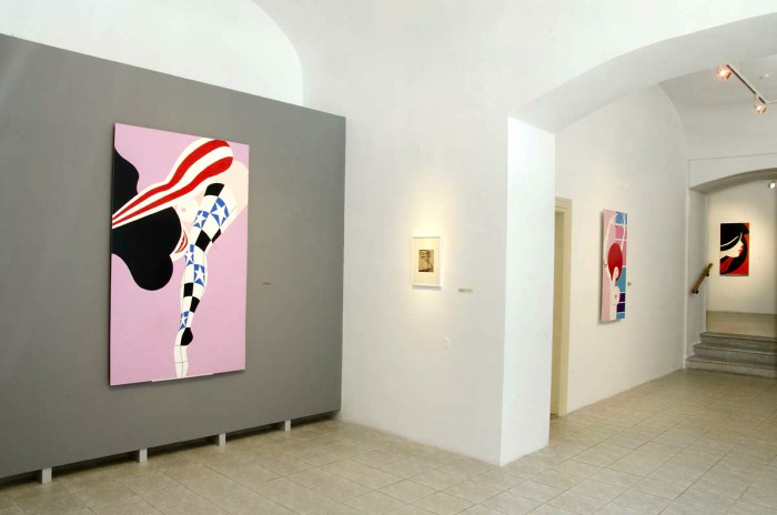
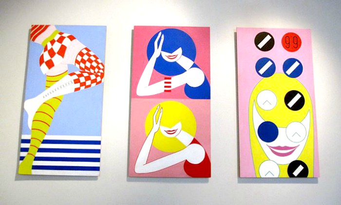
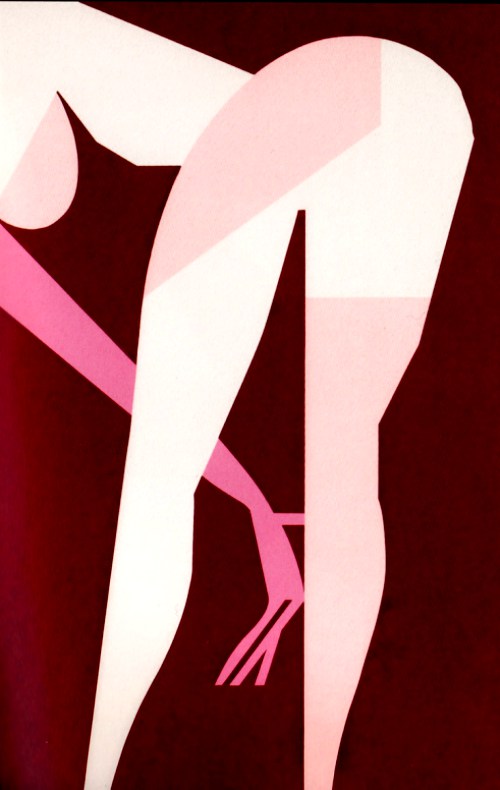
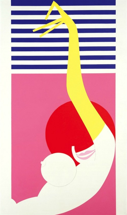
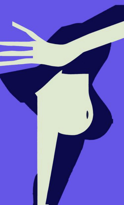
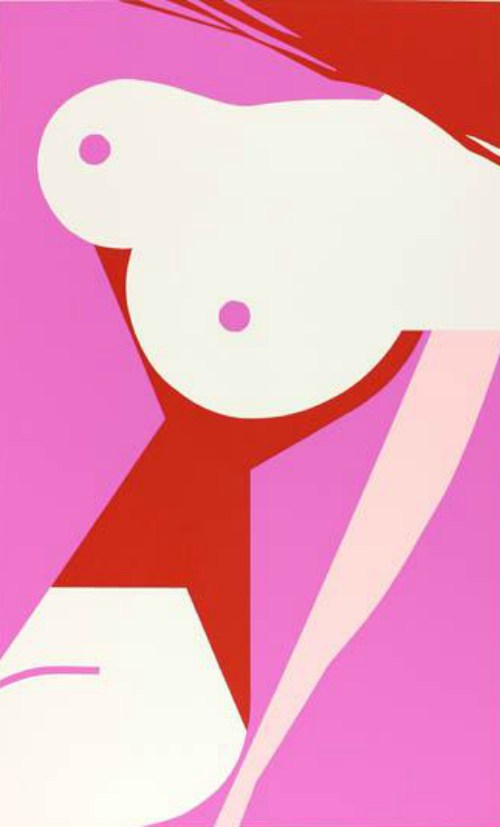
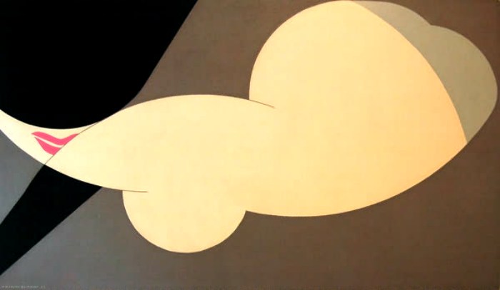
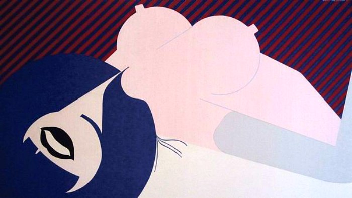
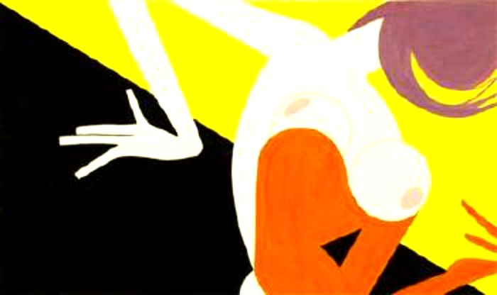
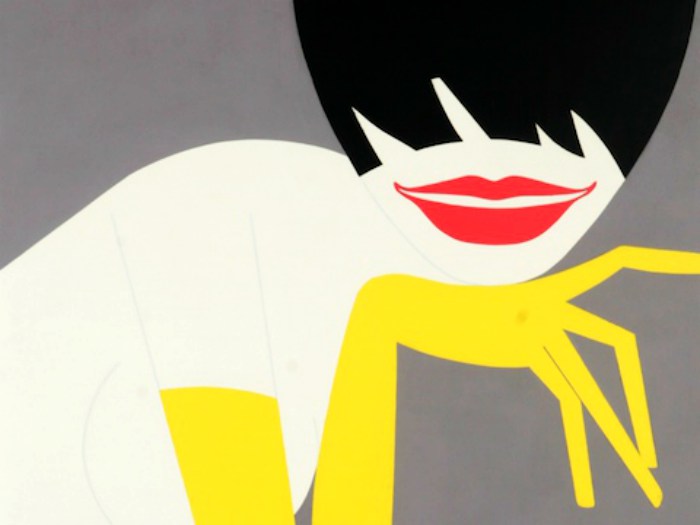
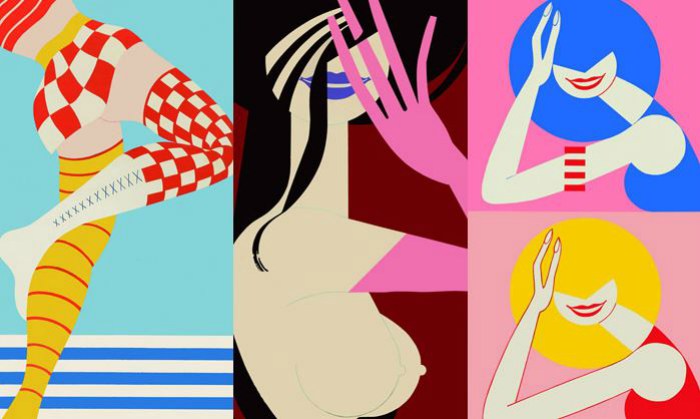
This series of flat, brightly colored canvases, somewhat resembling Saul Bass’s expressionist movie graphics wed to elements of Pop Art, “offers my personal comments on the old times and the shapely disrobing ladies who were so essential a part of the strip street scenery,” Sutnar wrote.
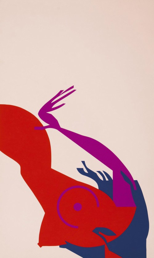
The private edition of 12 silkscreened prints interprets the impact of the swift “passing glimpse in the dim, murky, aphrodisiac atmosphere of female bodies in movement, shaking, swinging, quivering, twisting, rolling, and jerking.
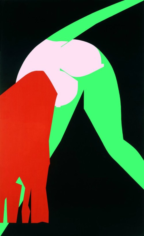
Or, maybe just an arm loosening the hair reflects the vivid, live, and lasting echo of the experience of living on the street.”
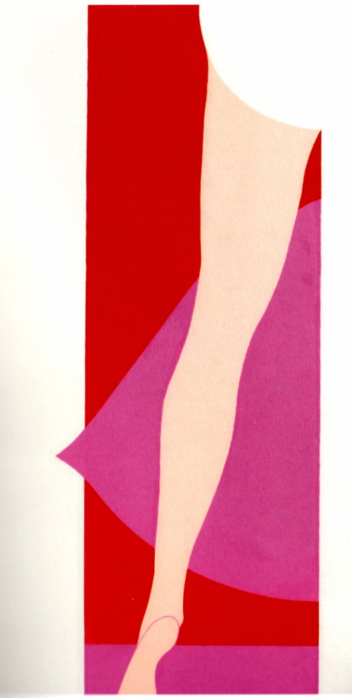
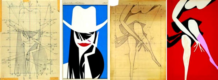
The accented silhouette, emphasizing the simplified form of the figure in action and the contrast of the flat, unshaded colors laid out one next to another, were the visual techniques he borrowed from his graphic design and used to make dramatic impressions. His visual shorthand resulted in bold, simple patterns.
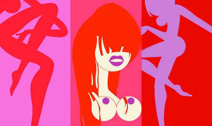
The term “posters without words” refers to Sutnar’s distinct poster-like design that characterizes the individual prints of this series.

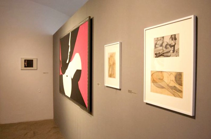
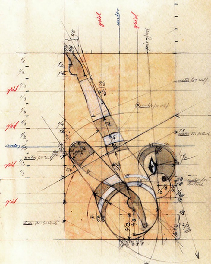
His sketches for the series show that he was meticulous with each design.
“In these disturbed times of cool and alienated society, if the paintings can inject the feeling, the mission is accomplished.”
We can see an obvious influence of Pop Art despite Sutnar’s dislike of Pop and Pop Art.
Sadly, Sutner’s career languished after this. He died a year after his Art Directors Club exhibit, believing the field had forgotten him.
What do you think?
Sources: AIGA, Fler, Naked Tour Guide Prague, Wikipedia,
We tirelessly gather and curate valuable information that could take you hours, days, or even months to find elsewhere. Our mission is to simplify your access to the best of our heritage. If you appreciate our efforts, please consider donating to support this site’s operational costs.
See My Exclusive Content and Follow Me on Patreon
You can also send cash, checks, money orders, or support by buying Kytka’s books.
Your contribution sustains us and allows us to continue sharing our rich cultural heritage.
Remember, your donations are our lifeline.
If you haven’t already, subscribe to TresBohemes.com below to receive our newsletter directly in your inbox and never miss out.


Very today. I love it.